The challenge:
Design a responsive ecommerce website for Mirror, a fictitious global clothing chain who sell clothing for everyone. They are very successful offline but need help expanding the company online to increase sales and get rid of inventory.
My role:
Create a new logo and online user experience for Mirror that satisfies the needs and wants of their customers, boosting sales and profits.
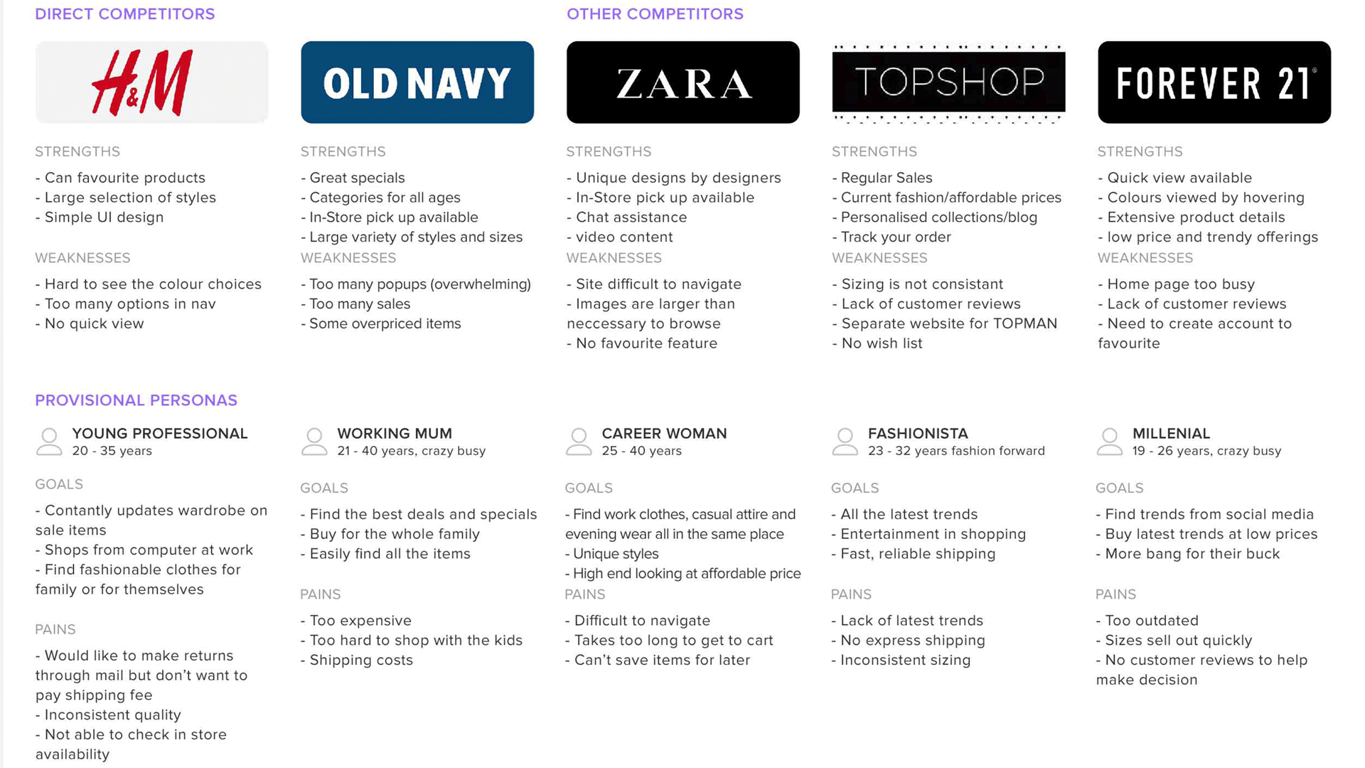
Research began by analysing trends in the competitive landscape and identifying opportunities. We then conducted empathy research to understand their recent online shopping experience, their expectations in online shopping and their frustrations.
Customers are now shopping more often, or more specifically, in more places. They are shopping at work, on the bus, laying in bed on their phone. Brand loyalty is important as consumers are shopping more with emotions rather than the price tag.
Customers are being advertised through social media regularly, and eDM advertising helps boost sales online. 39% use social media for inspiration on what to buy.
Customers seem to enjoy features like favourite items, save for later wishlists, in-store pick up, chat assistance, free shipping, free return shipping, quick view and colour options while hovering over the image.
Fit of products are the number 1 reason items are returned. An online clothing store, Modcloth, uses customer reviews (including an image of the customer wearing the clothing) to help customers choose the right fit. This seems to be what people want.
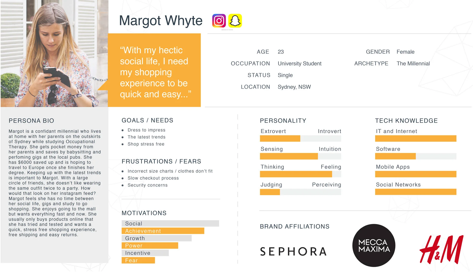
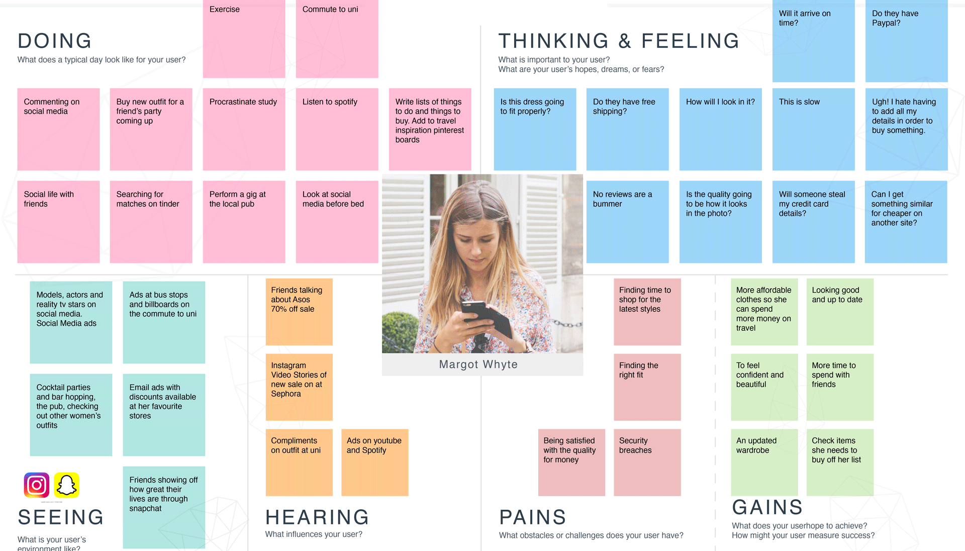
PAINS
• Finding time to shop for the latest styles
• Finding the right fit
• being satisfied with the quality for money
• Security breaches
GAINS
• More affordable clothes so she can spend more time on travel
• To feel confident and beautiful
• An updated wardrobe
• Looking good and up to date
• More time to spend with friends
• Check items she needs to buy off her list
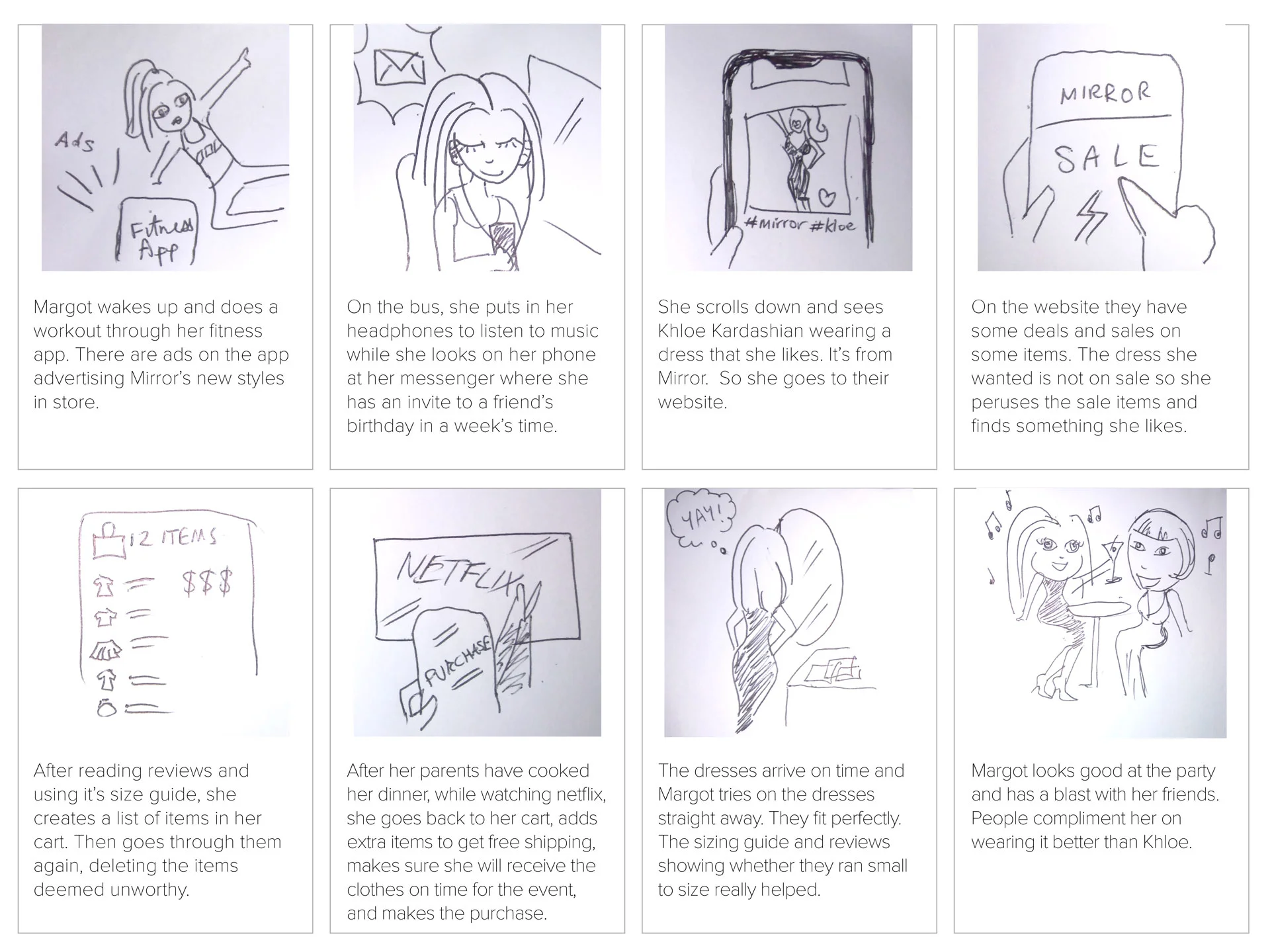
We illustrated a storyboard that captures the persona’s user journey when using the mirror website. This helped prioritise features for the site and decide on a user flow.
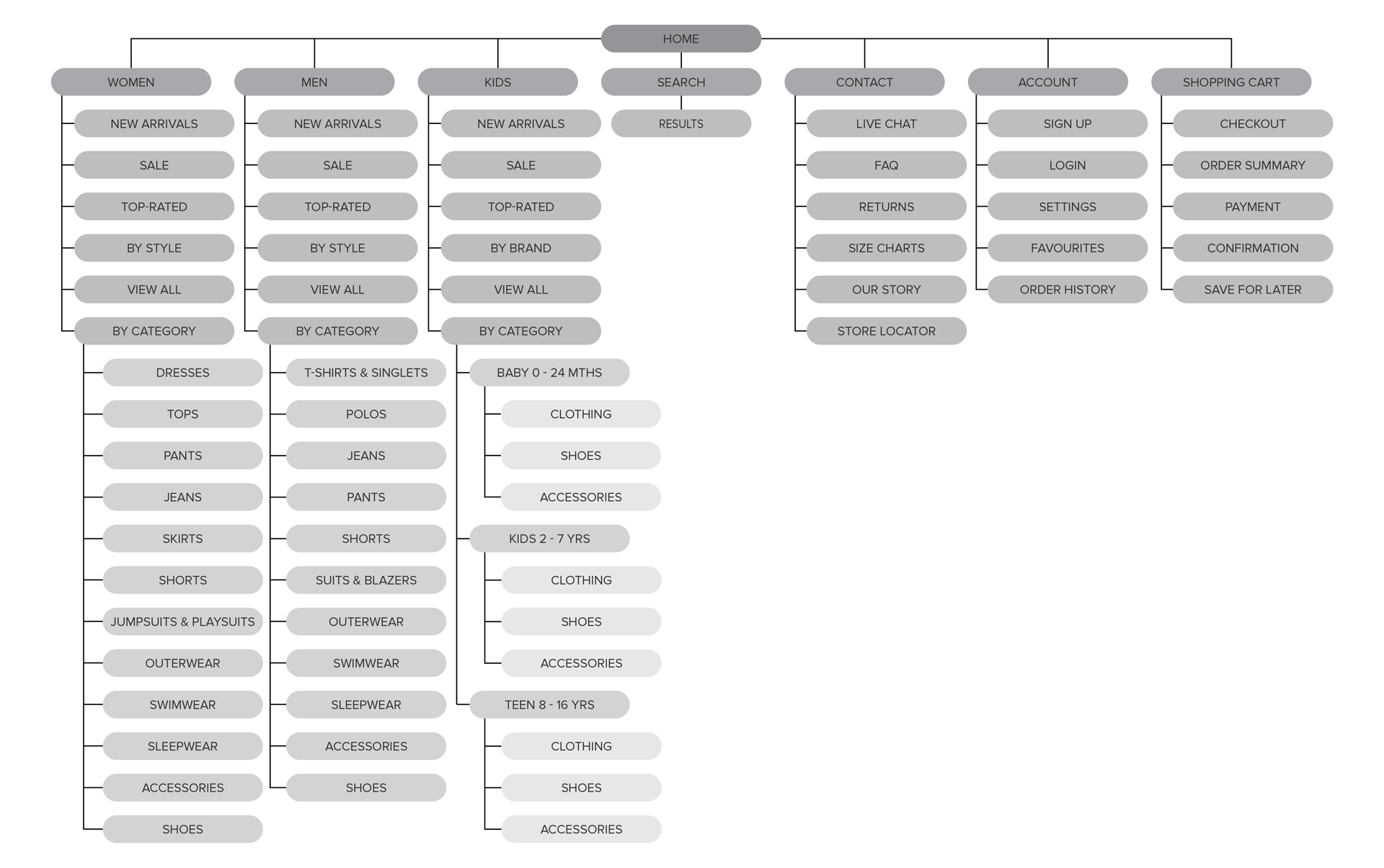
After conducting an open card sorting exercise and gathering the consistencies in the similarity matrix, the Mirror sitemap was mapped out.
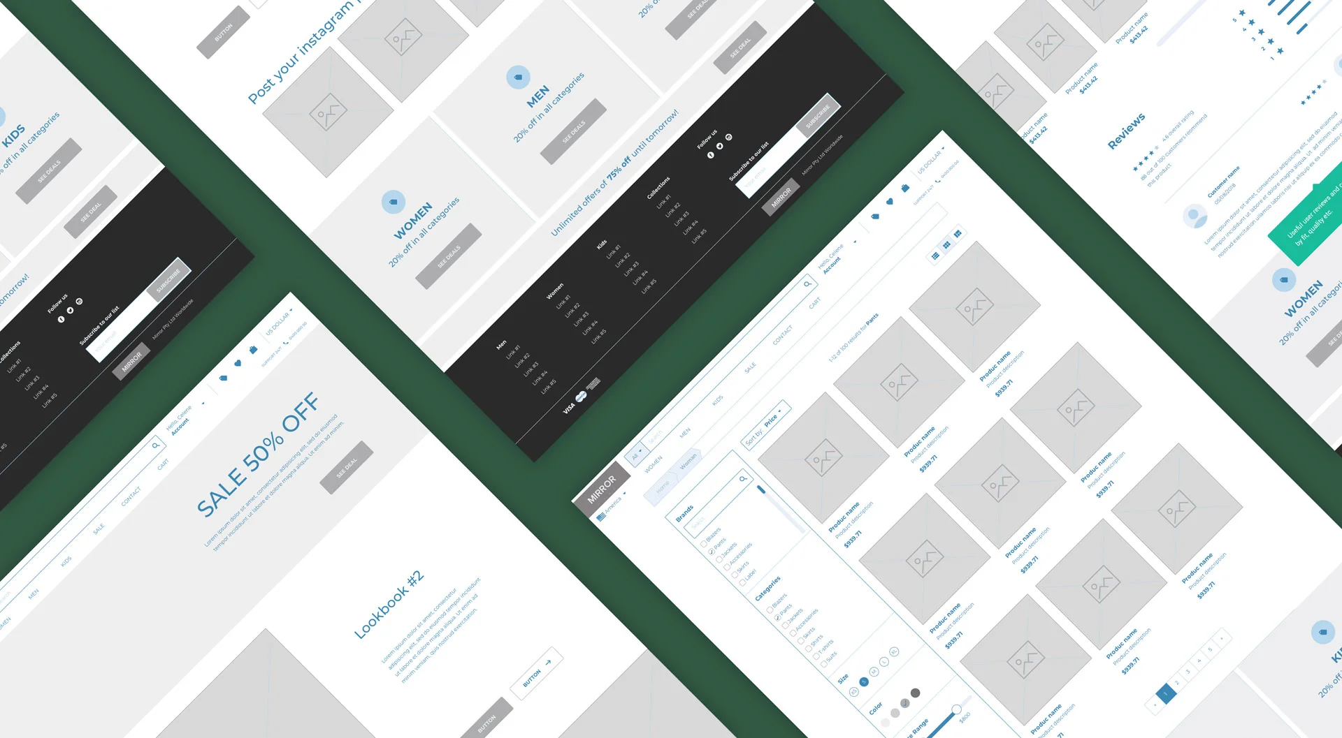
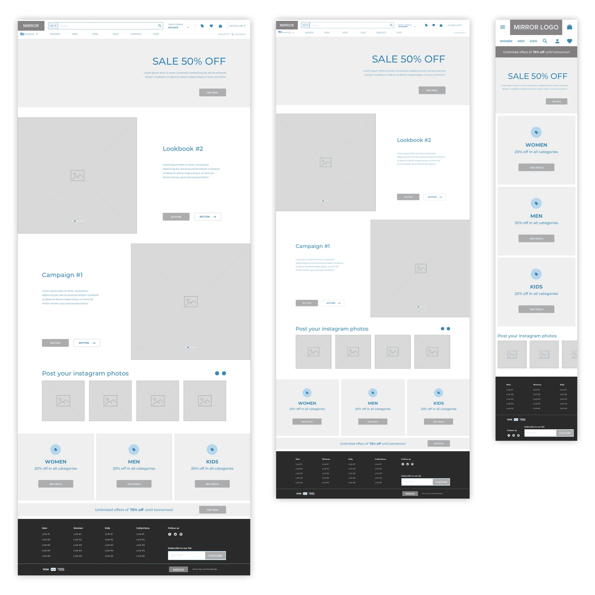
Designs were first sketched on paper, then built into low-fidelity wireframes in Sketch keeping in mind the following opportunities:
• Provide accurate depictions of sizing/fit relating to clothing they already own
• Interactive how to guides on finding your size
• Minimize steps in the return process
• Include real customer reviews about products
• Create simple categories and filters for ease of use
• Provide Paypal or secure checkout options and FREE shipping over a certain amount
• Offer in store try on for clients to test a product before purchasing
• Design website with effective interface that allows users to accomplish their needs with minimal clicks, no login if they choose
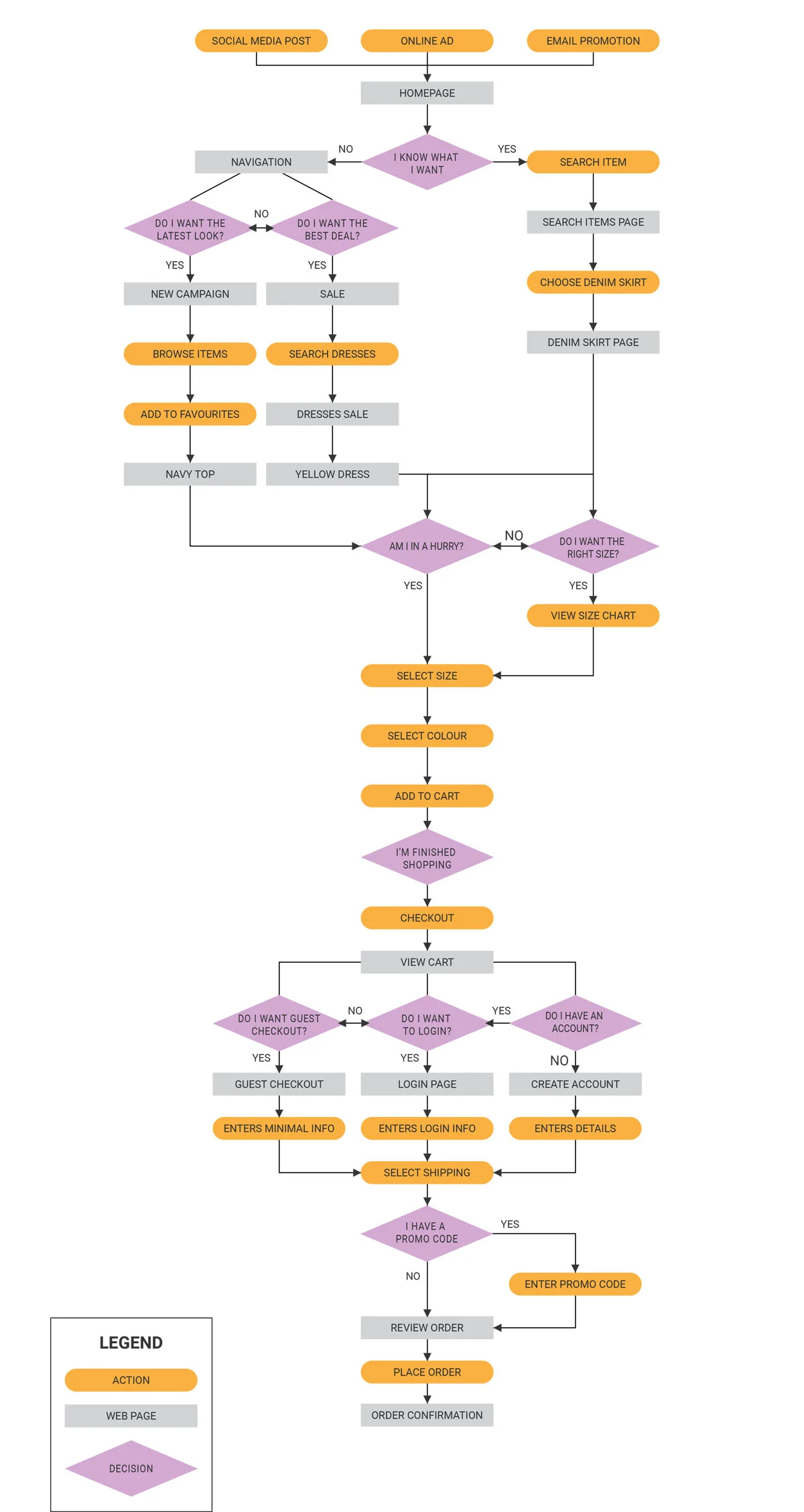
User flows and a task flow was created to visualise the path a user would take to complete a task. The user flow below maps out the path from entering the website homepage through to the order confirmation.
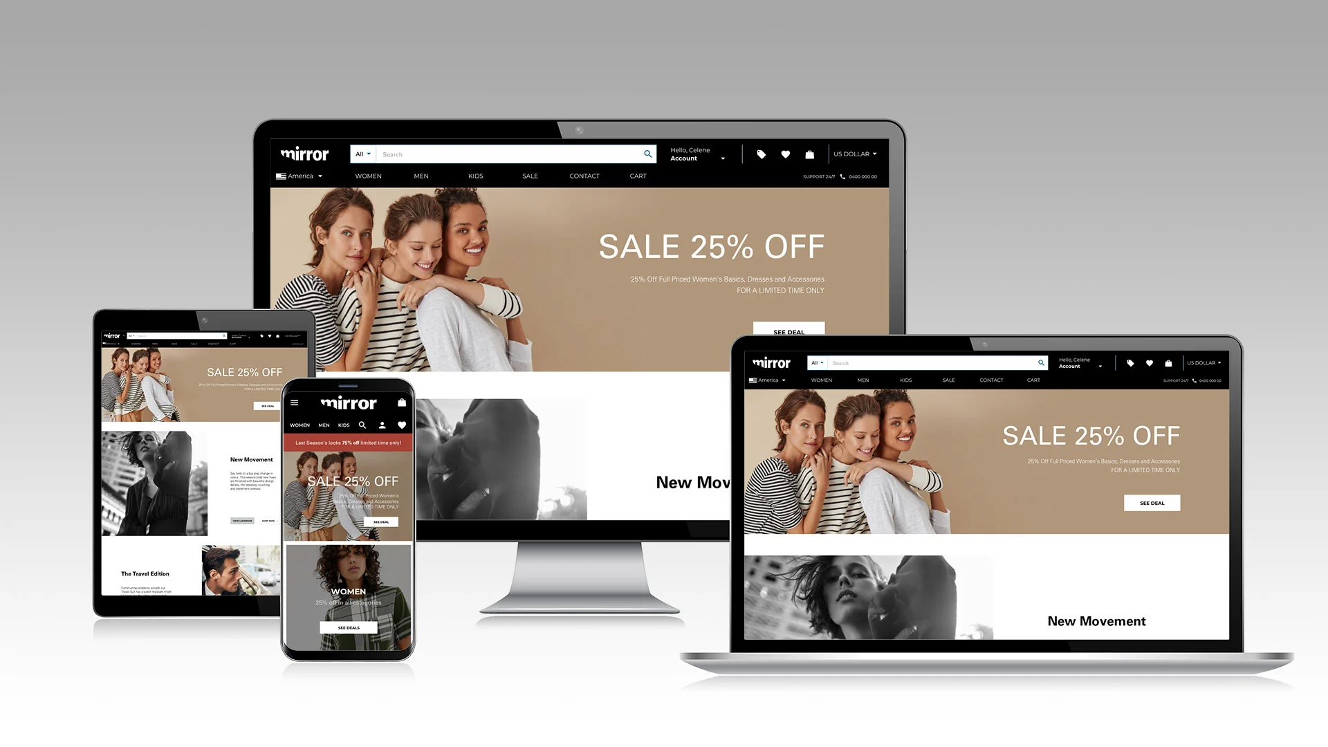
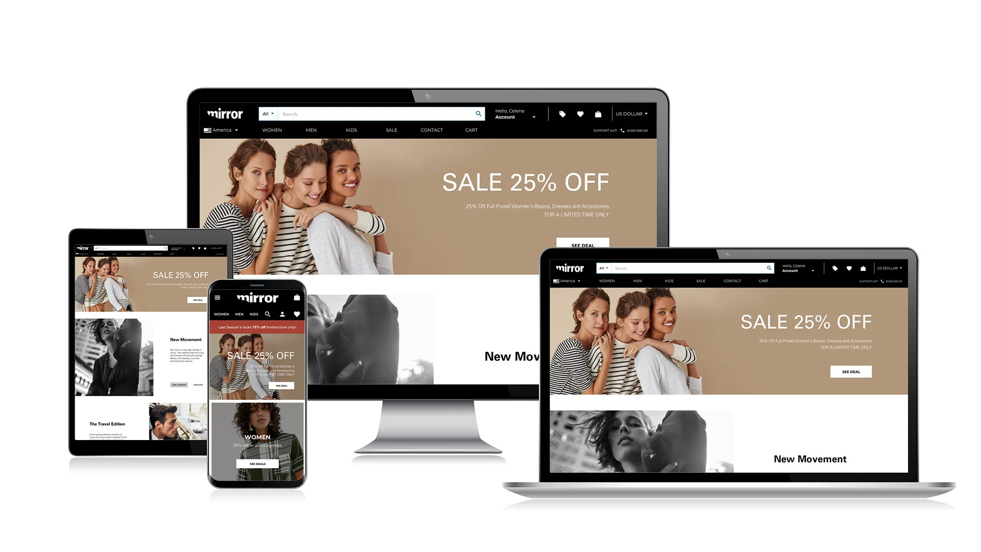
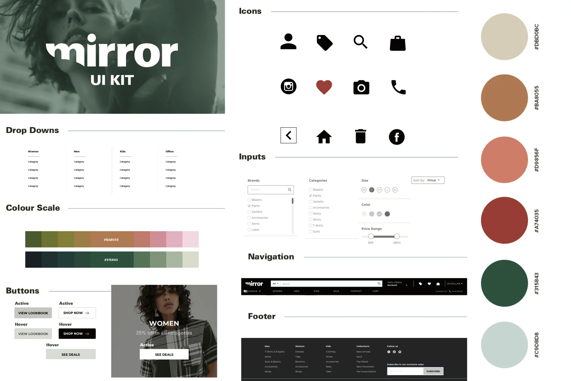
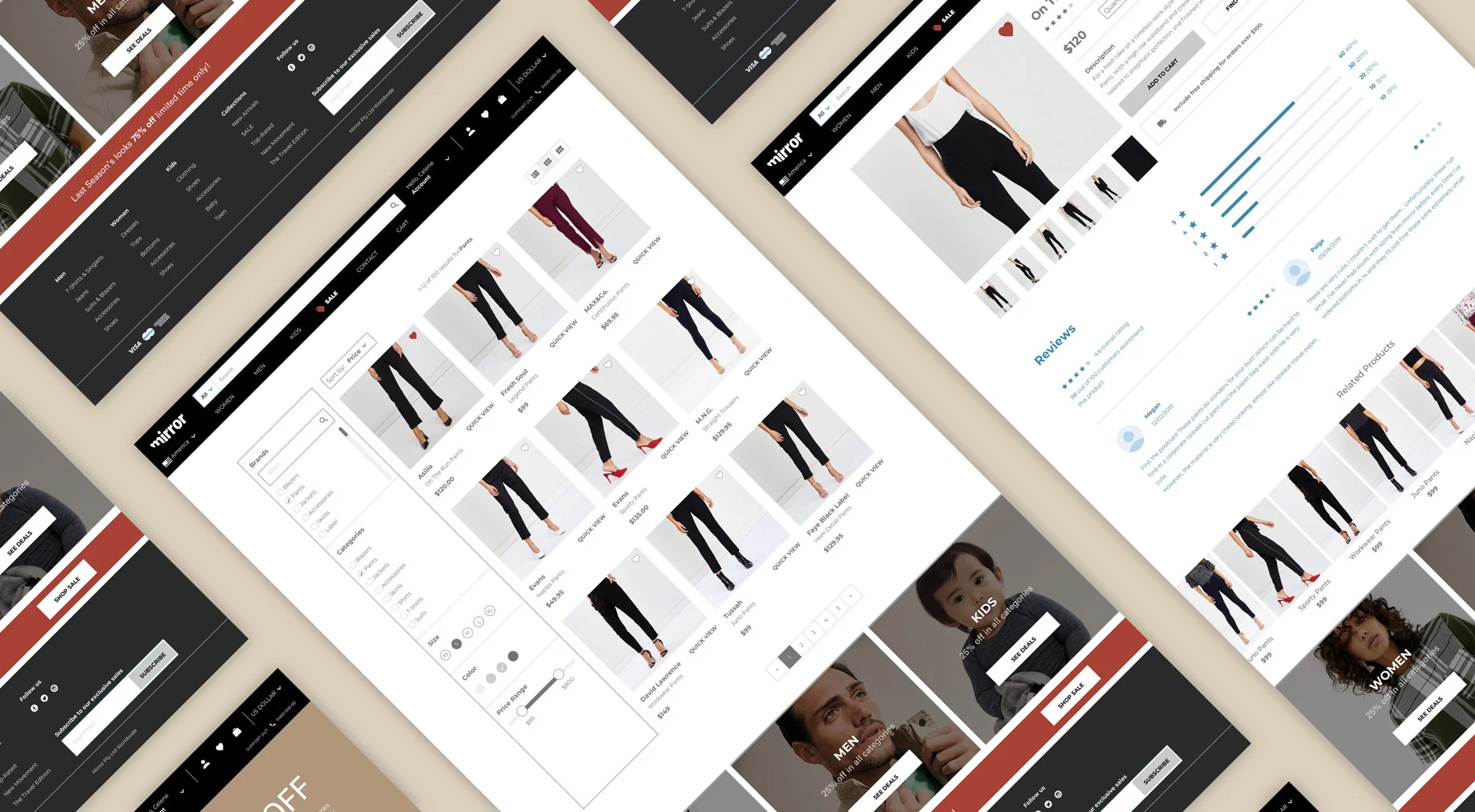
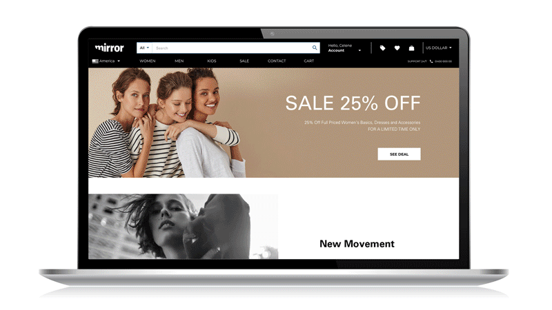
Based on research findings, the interface of the ecommerce site needed to be clean, modern, sophisticated and social. With this in mind, photos of the clothing and lookbooks is to be the primary features. With sans serif typography, lots of white space and neutral tones, the interface oozes sophistication. The logo is a bold sans serif typeface with the curvature of a woman’s body cut out of the bottom left, symbolising what women see in the mirror, their glorious shape. The interface needed to be easy to have a fun, hassle-free shopping experience with the least amount of clicks as possible.
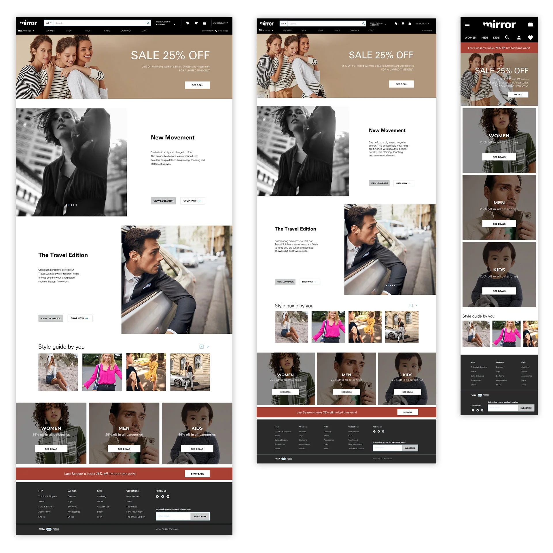
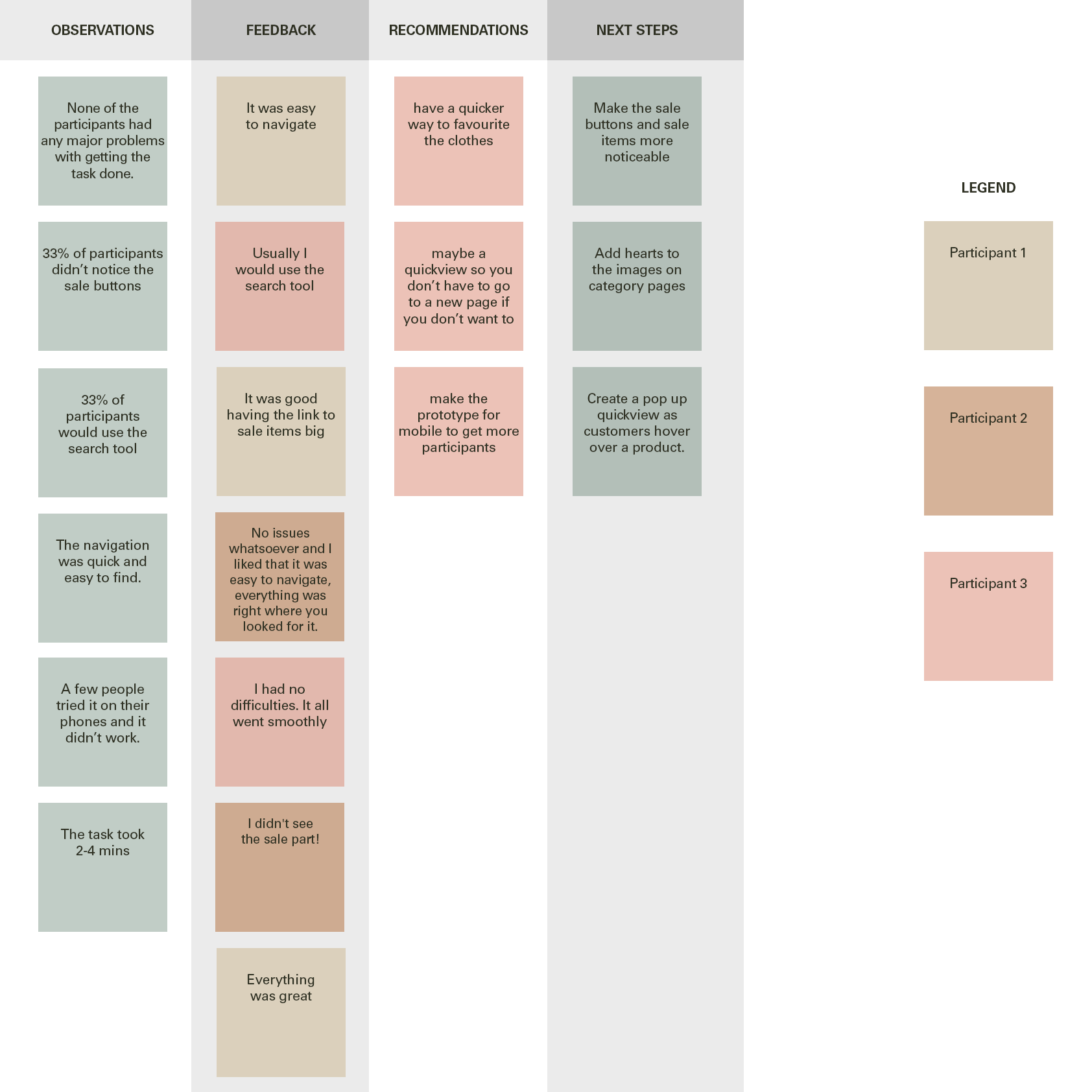
There were 3 participants aged between 23-40 years old who participated in the usability testing. I sent them the prototype and called them afterwards to find out their patterns, positive experiences and pain points. I lay them out in an affinity map to point the direction towards the next steps and final responsive website design.
Low fidelity prototypes were made for desktop and mobile. High fidelity prototypes were created for desktop using InVision. Once usability testing was completed, revisions were made to the prototype.
Creating a shopping experience that would satisfy users was challenging although the data that surfaced was interesting. A large percentage of users reported ‘incorrect fit’ being their primary concern. The pop up size guide was developed to solve this problem as well as options available for easy returns. Paypal provided on checkout solved users’ security concerns. For this case study, I only focused on one task flow and one task for the usability testing. Given more time, I would like to experiment with other task flows and a few other personas. Also in-person usability testing would have been better to collect data. In future, I hope to achieve more accurate results from the high-fidelity prototype.